

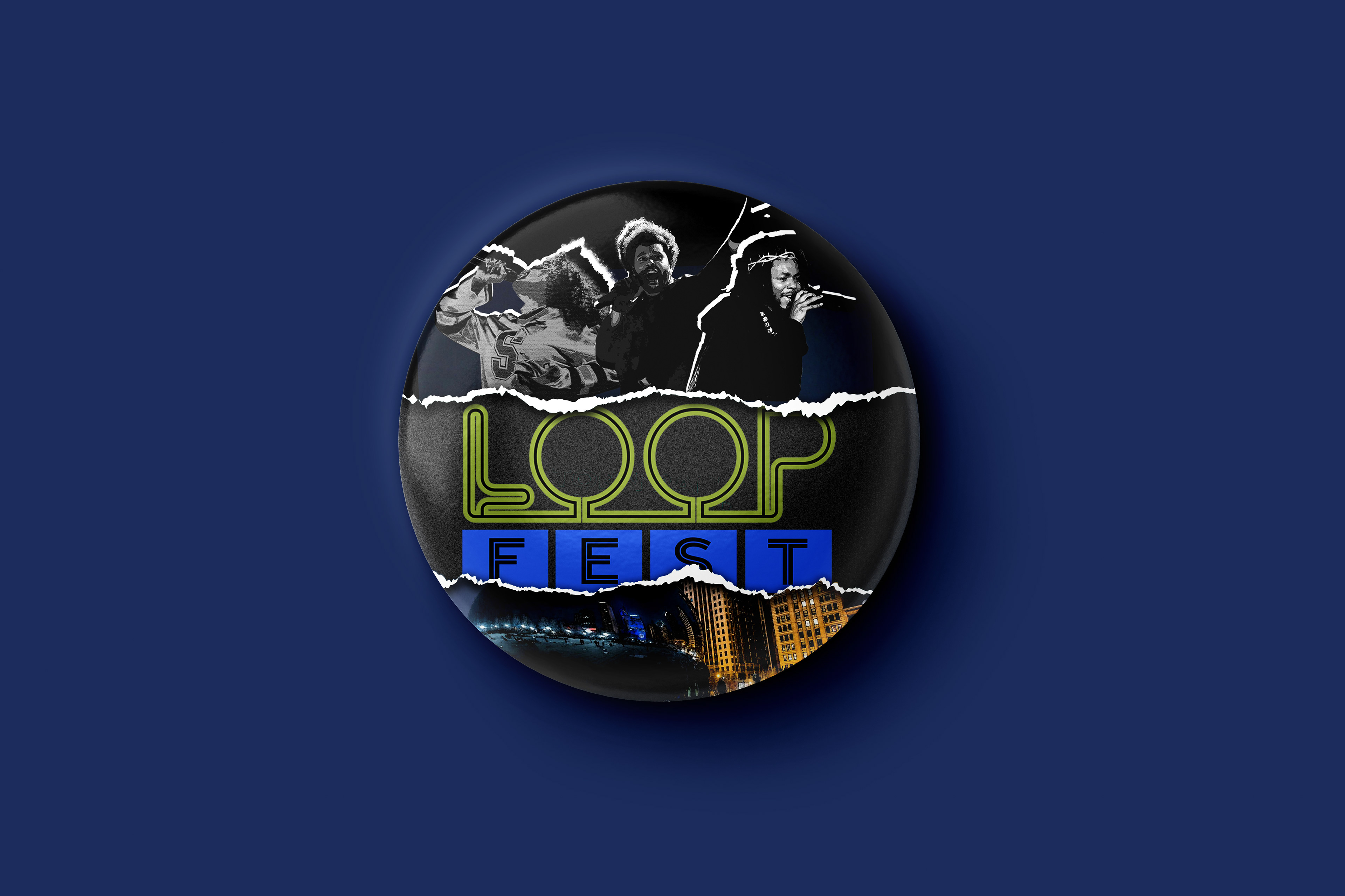
PITCH
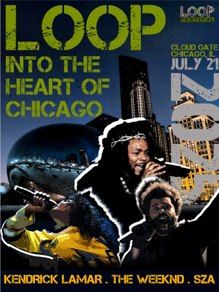
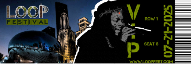
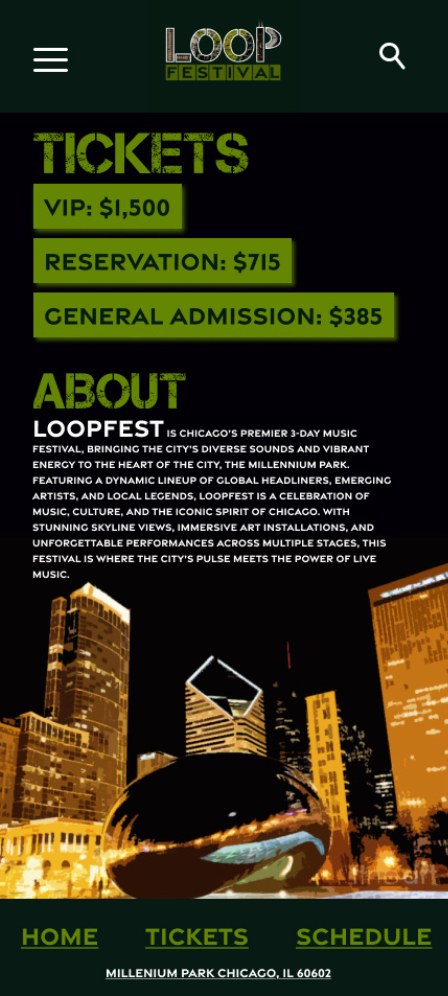
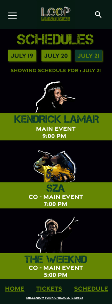
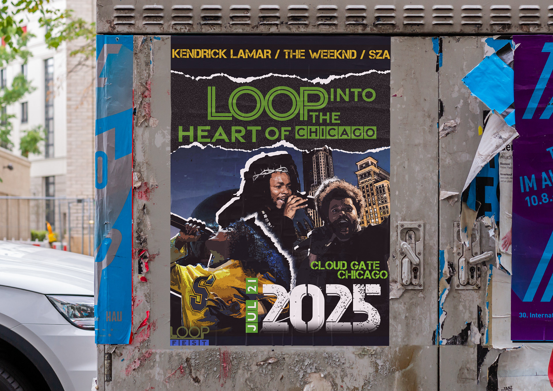
LoopFest is Chicago’s premier 3-Day music festival, bringing the city’s diverse sounds and vibrant energy to the heart of the city, the Millennium Park. Featuring a dynamic lineup of global headliners, emerging artists, and local legends, LoopFest is a celebration of music, culture, and the iconic spirit of Chicago. With stunning skyline views, immersive art installations, and unforgettable performances across multiple stages, this festival is where the city’s pulse meets the power of live music.
The concept behind this branding project was to highlight Chicago's iconic "Loop" and the vibrant atmosphere that surrounds it. Having lived in Chicago for several years, I aimed to capture the city's dynamic rhythm and distinctive energy through bold visuals and intentional design elements. This project serves as both a tribute to Chicago’s architectural character and a personal expression of my connection to the city.
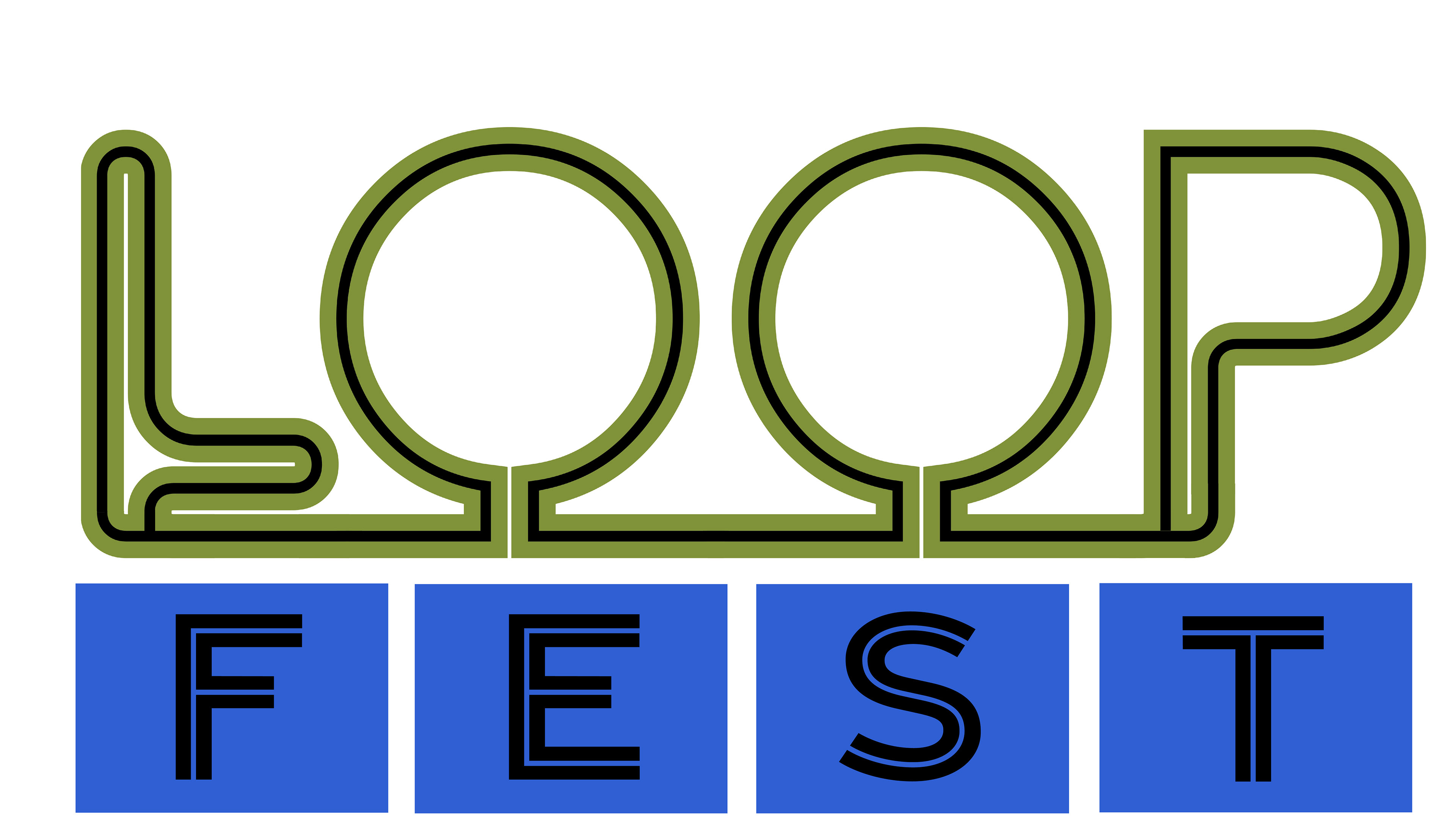
Initially, I wanted the logos to be playful and filled with multiple colors to imitate the energy I wanted from the festival.
FIRST FINISH
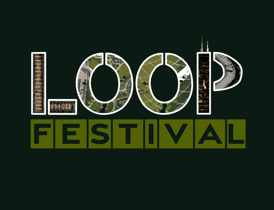
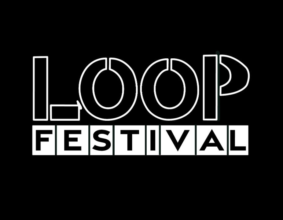
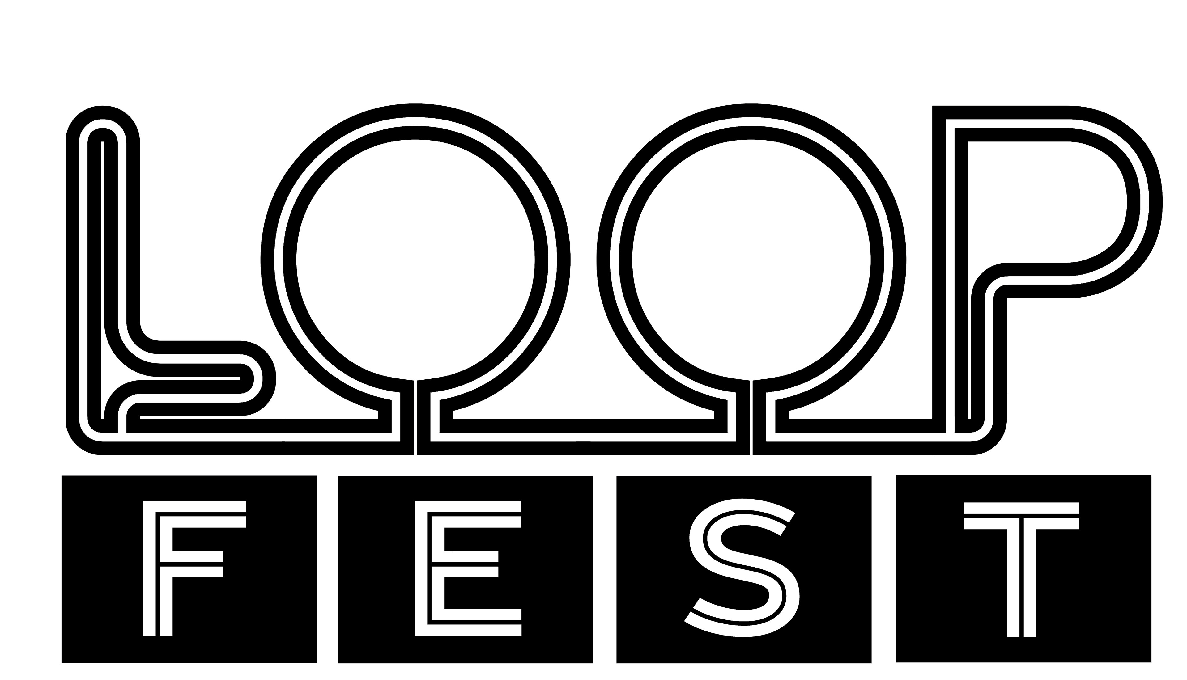
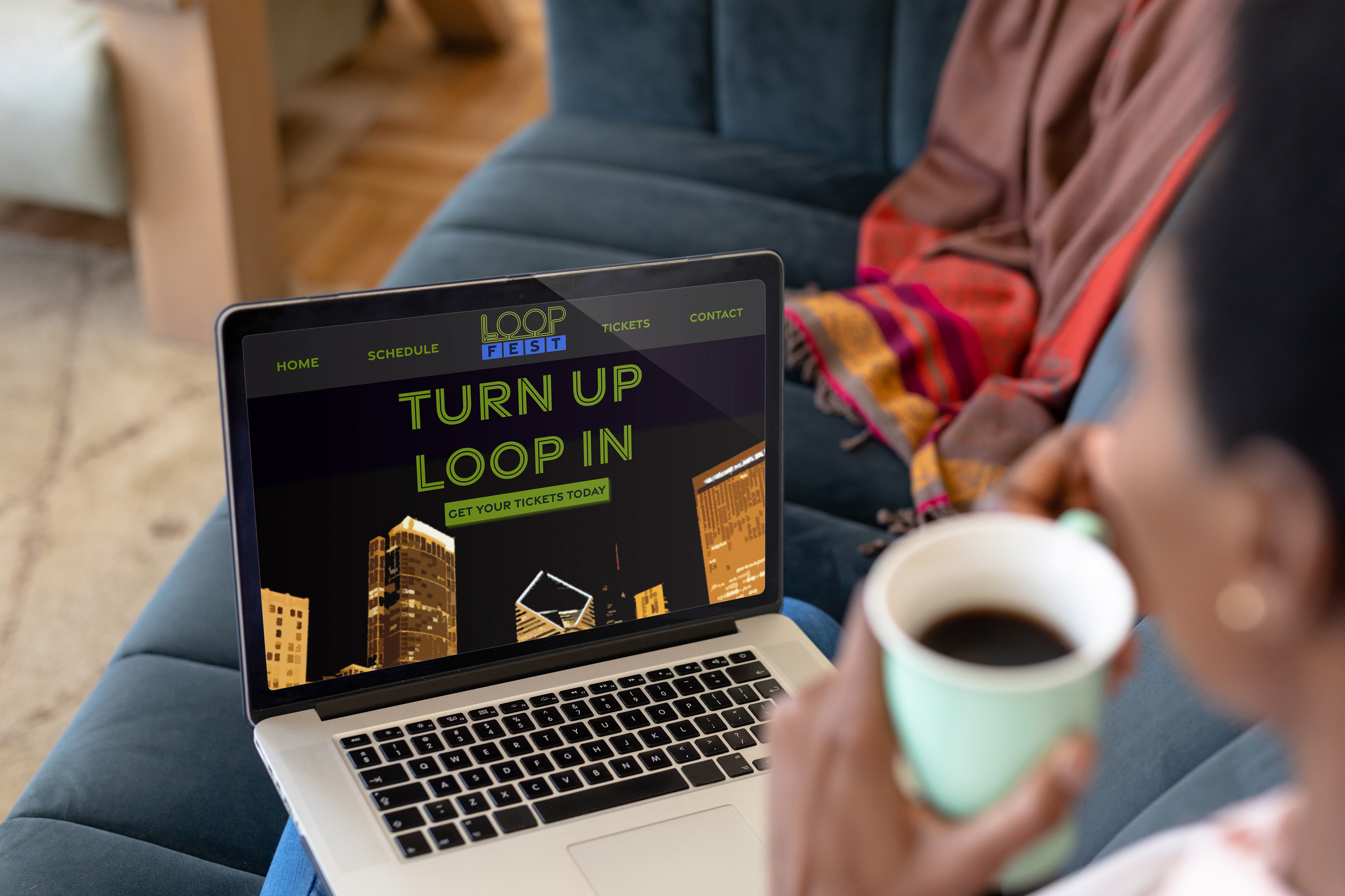
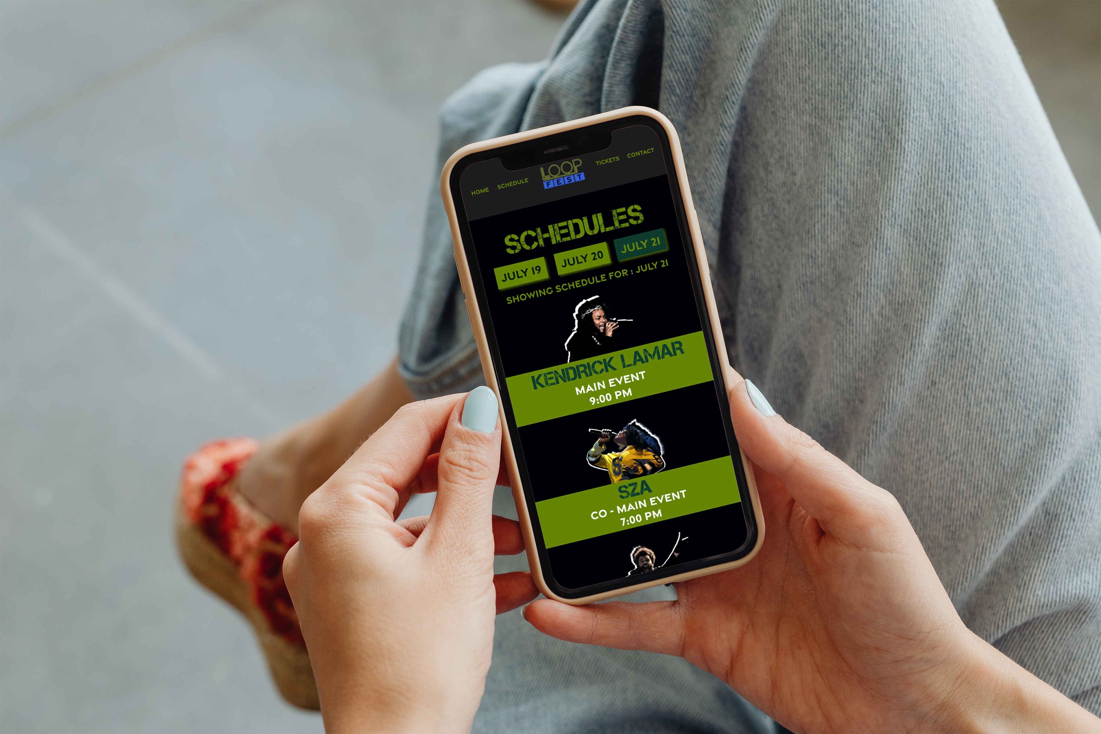
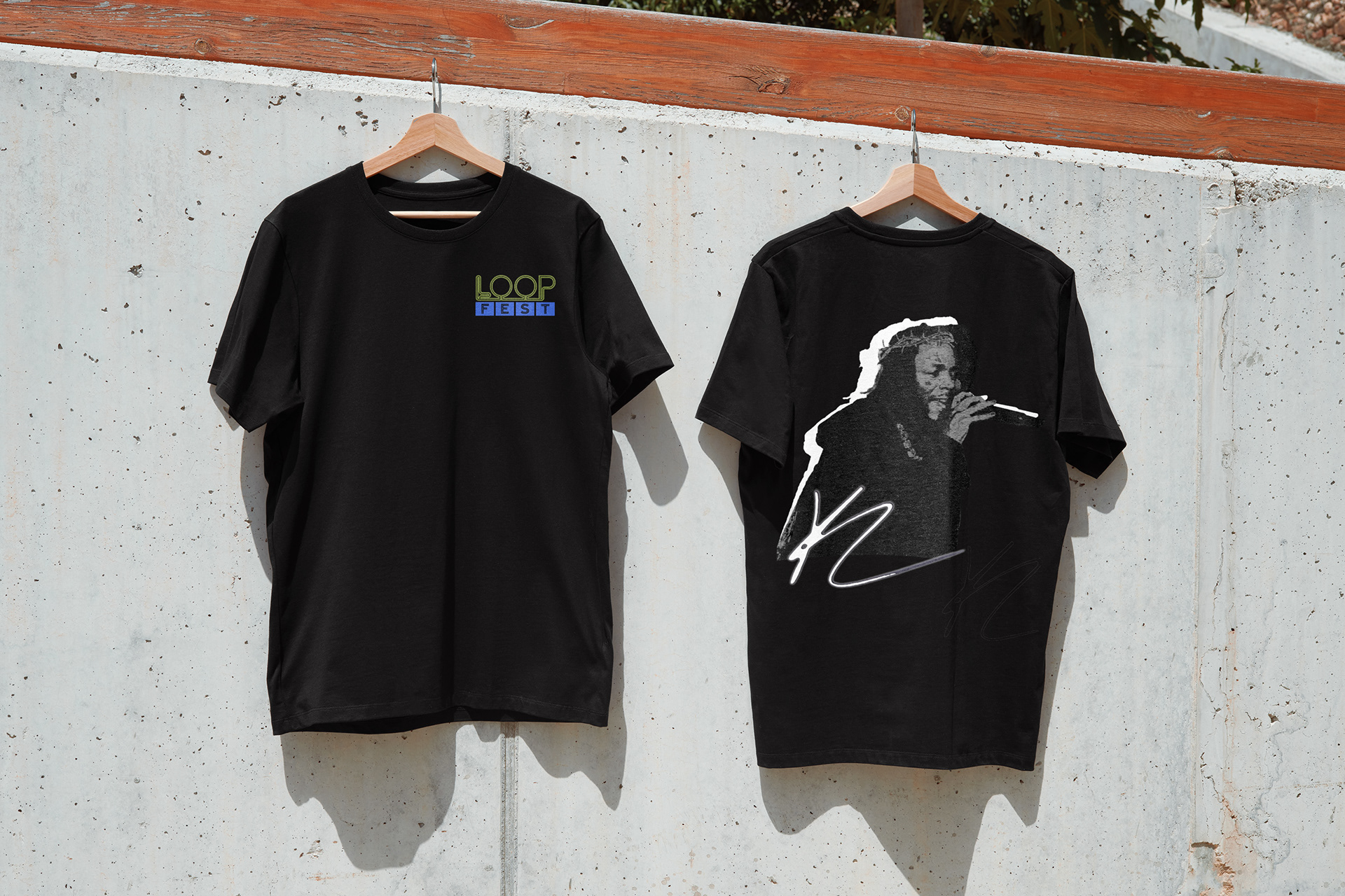
Following feedback from my professor and peers, I concluded that the logo needed to be simplified and more effectively reflect the meaning of the word "LOOP." Additionally, I initially used the same typeface throughout the poster and ticket designs, but I now recognize the importance of incorporating a more diverse typographic approach to better capture and maintain viewer interest.
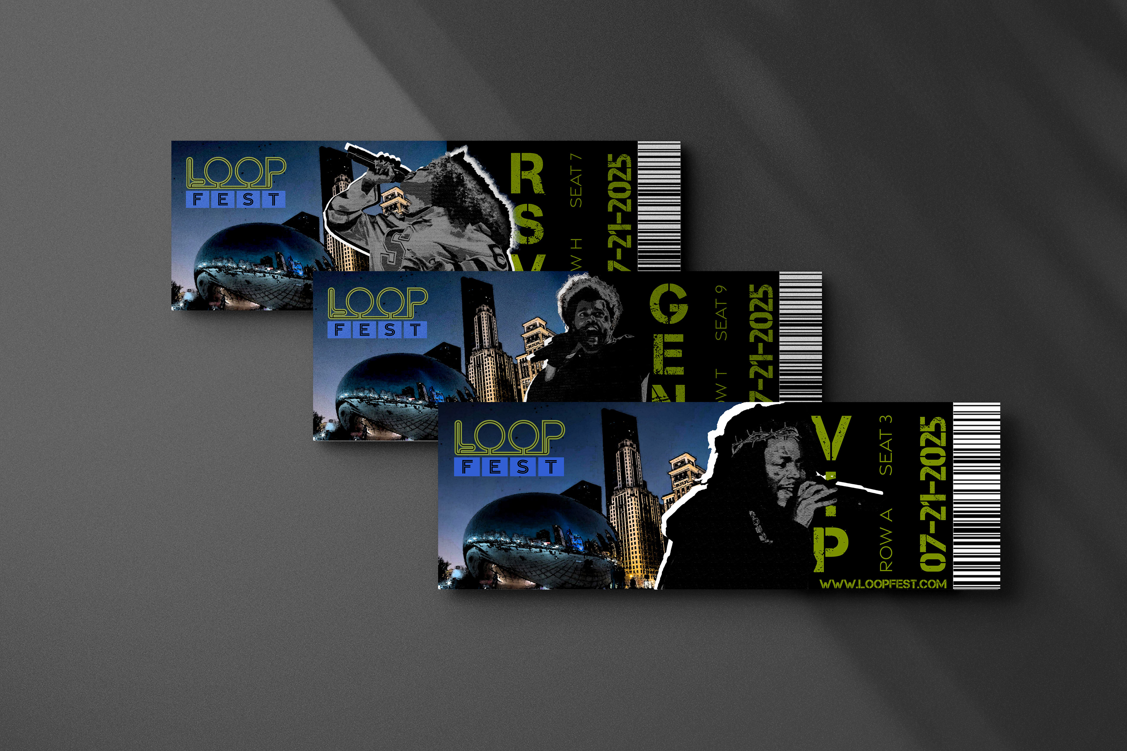
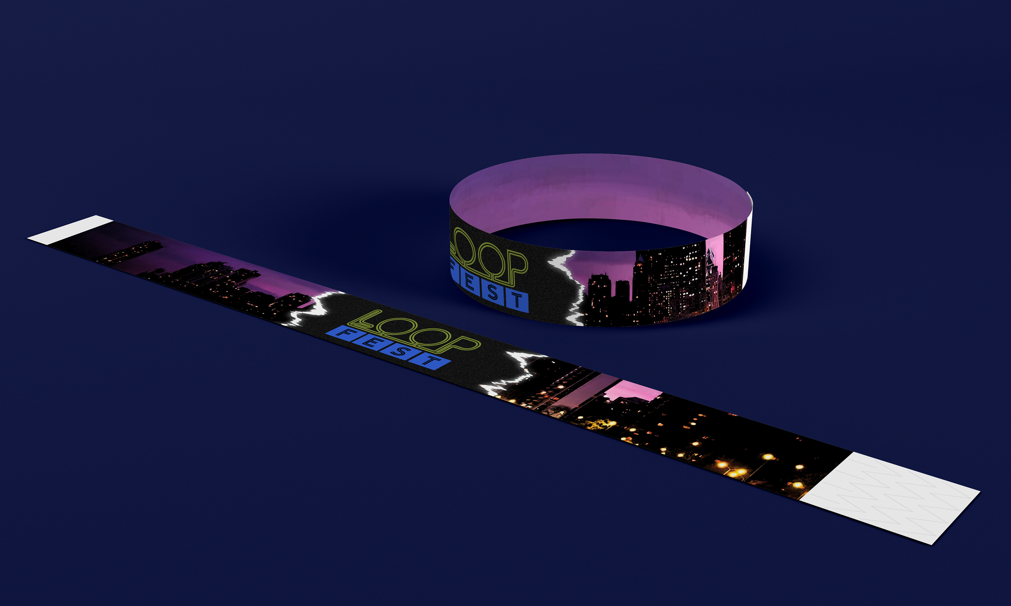
FINAL OVERVIEW

CONCLUSION
This project let me combine my own memories with creative design to highlight what makes Chicago special. It helped me think about how places and experiences can be shown through visuals. Working on it made me appreciate how design can tell personal and powerful stories.